PDF Library for Delphi flows a retained passage through one to 64 equal-width columns with DrawTextFlowColumns, and breaks its lines with bounded language-aware hyphenation once you call SetTextFlowLanguage and SetTextFlowHyphenation. Nine languages are supported, and the language can be inherited from the document Catalog /Lang value rather than set per flow
Both features exist for the same reason: a narrow column is where naive line breaking stops looking like typesetting and starts looking like a bug report
Why does justified text fall apart in narrow columns?
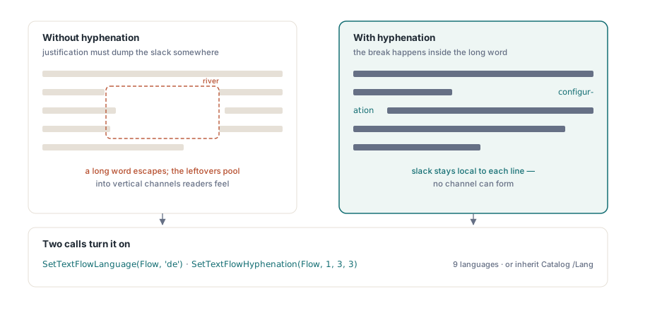
Because justification distributes leftover space into the word gaps of a line, and the amount left over depends on what fits. In a wide measure the leftover is small and the eye never notices. Halve the width and a single long word that will not fit pushes to the next line, leaving its predecessors to absorb all that space. Three such lines in sequence produce the vertical white channels typographers call rivers, and readers experience as text that is hard to follow without knowing why
Hyphenation fixes the cause instead of the symptom by allowing a break inside the word. German and Dutch compounds make this non-negotiable: a 24-character noun in a 60-millimeter column has no good outcome without a break point. English tolerates the absence better, which is why English-first products often ship layout code that falls over the first time a German customer runs it
Which languages, and where does the language come from?
Hyphenation covers English, German, Dutch, French, Spanish, Italian, Portuguese, Russian and Turkish. Set it explicitly per flow with SetTextFlowLanguage, or let it be inherited from the document Catalog /Lang entry, which is the value a tagged and accessible document already carries
That inheritance is worth using rather than overriding. A document that declares its language in the Catalog is telling screen readers, search indexers and hyphenation the same fact from one place, and one place is where a fact should live. If you are already producing tagged output as described in automatic tagging for accessible PDFs, the language entry is set and the flow can simply follow it
var
  Lib: TPDFlib;
  Flow, Drawn: Integer;
begin
  Lib := TPDFlib.Create;
  try
    Lib.SetOrigin(1);
    Lib.AddTrueTypeFont('Georgia', 1);
    Lib.SetTextSize(10.5);

    Flow := Lib.NewTextFlow(ArticleBody);
    try
      Lib.SetTextFlowLanguage(Flow, 'de');
      // Enable, at least 3 characters before the break, 3 after
      Lib.SetTextFlowHyphenation(Flow, 1, 3, 3);
      Lib.SetTextFlowMinLines(Flow, 2);   // never strand a single line

      repeat
        // Three columns across a 480 pt region, 18 pt gutters, balanced
        Drawn := Lib.DrawTextFlowColumns(Flow, 72, 720, 480, 620, 3, 18, 1);
        if (Drawn = 0) or (Lib.TextFlowFinished(Flow) = 1) then
          Break;
        Lib.NewPage;
      until False;
    finally
      Lib.ReleaseTextFlow(Flow);
    end;

    Lib.SaveToFile('newsletter.pdf');
  finally
    Lib.Free;
  end;
end;
MinPrefix and MinSuffix are typography, not validation
The two integers after the enable flag set the minimum number of characters that must remain before and after a break. Three and three is a conservative default that most house styles accept. Two and two produces more break opportunities and noticeably uglier results, because a two-letter fragment dangling at the end of a line reads as a typo
Raise the minimums when the type is large, where each fragment is visually prominent, and lower them only when the column is genuinely narrow and you have decided that a tight measure matters more than a clean one. This is a house-style decision rather than a technical one, which is exactly why it is a parameter instead of a constant
What does "balanced" actually mean here?
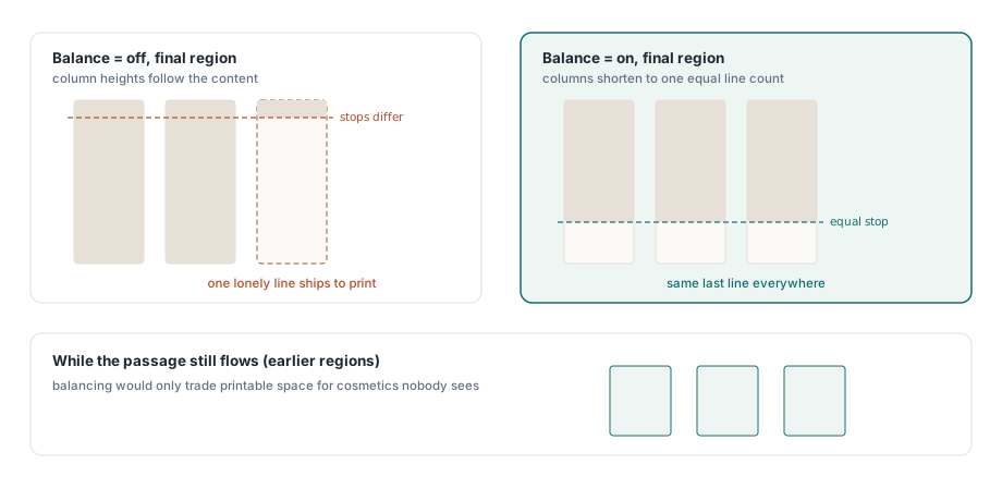
The Balance parameter changes behavior only at the end of a passage. With balancing on, the columns are shortened to an exact equal line count when everything remaining fits inside the region, which is what stops a final page from showing two full columns and a third holding one lonely line. When the passage does not fit, every column keeps its full height so the page carries as much text as it can and the remainder continues on the next page
That asymmetry is the correct default for continuous documents. Balancing in the middle of a flowing article would waste vertical space on every page for a cosmetic effect nobody sees, since the columns are full anyway. Balancing at the end is where the eye actually notices, and that is precisely where it applies
Line breaking measures whole words
The breaking algorithm measures complete words rather than accumulating character widths, and reserves a bounded search for oversized tokens that cannot fit a line at all, such as a URL or an accession number. That keeps the common case fast and the pathological case bounded, instead of the other way round
Discretionary soft hyphens and automatic hyphens are rendered only when the break they mark is the break that gets chosen. This sounds obvious and is a classic defect: a naive implementation writes the hyphen character while measuring, and if the break moves, the hyphen stays behind in the middle of a line. Nothing looks more like a broken text engine than a stray hyphen inside a word
var
  Lib: TPDFlib;
  Flow, Needed: Integer;
begin
  // Decide the layout before drawing anything
  Flow := Lib.NewTextFlow(ArticleBody);
  try
    Lib.SetTextFlowLanguage(Flow, 'fr');
    Lib.SetTextFlowHyphenation(Flow, 1, 3, 3);

    // Lines the rest of the passage needs at one column width
    Needed := Lib.MeasureTextFlow(Flow, 148);
    if Needed > 3 * LinesPerColumn then
      UseTwoPageSpread
    else
      UseSinglePage;

    Lib.DrawTextFlowColumns(Flow, 72, 720, 480, 620, 3, 18, 1);

    if Lib.TextFlowFinished(Flow) <> 1 then
      CarryOver(Lib.GetTextFlowRemaining(Flow));
  finally
    Lib.ReleaseTextFlow(Flow);
  end;
end;
Keep the font settings identical across boxes
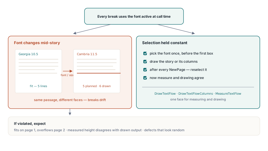
One rule governs every flow-based layout and it is worth stating bluntly: DrawTextFlow, DrawTextFlowColumns and MeasureTextFlow all break lines using the font selected at the moment they are called. Change the font or size between two boxes of the same flow, or start a new page without reselecting one, and the second box breaks differently from what the first measured
The symptom is maddening precisely because it looks intermittent: text that fits on page one overflows on page two, or a measured line count disagrees with what was drawn. Select the font once before the loop, reselect it after each NewPage, and the flow behaves. When mixed scripts appear in the same passage, the resolution described in automatic font fallback for CJK and emoji text applies to both measurement and drawing, so widths stay consistent across the fallback runs too
For report layouts where the flow is one element among headers, footers and data-driven blocks, the composition patterns in the dataset report engine combine cleanly with column flows: measure first, place the fixed furniture, then give the flow whatever region is left
PDF Library for Delphi is a Delphi, C++Builder and Lazarus PDF library, and the complete TextFlow lifecycle, creation, drawing, measurement, inspection, rewind and release, is exposed through the DLL and ActiveX interfaces as well. Full documentation is on the PDF Library for Delphi Delphi PDF library page