Set 「コード」 down a page by drawing it one character at a time, each call one em lower than the last, and three of the five glyphs come out wrong. The two corner brackets sit in the column the way they sit on a horizontal line, opening sideways, and the long vowel mark ー is a flat dash cutting across the column where a Japanese reader expects a short vertical stroke. Only コ and ド, the two ordinary katakana, look the way a typesetter would set them
Rotating the whole line ninety degrees fixes the brackets and the long vowel mark more or less by accident and breaks everything else: every kanji and kana now lies on its side. Vertical writing does three things at once. Characters stay upright, the advance runs down the page instead of across it, and a handful of characters switch to different drawings. Getting all three right needs a font that carries vertical forms and vertical metrics, and a PDF font that is set up to use them
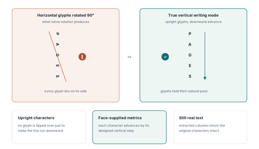
Turning on vertical writing in PDF Library for Delphi
PDF Library for Delphi treats vertical writing as a drawing mode. SetVerticalWritingMode(1) switches it on, every DrawText call after that runs down the page from the point you give it, and SetVerticalWritingMode(0) brings horizontal text back. The setter returns the mode that was in force before the call and GetVerticalWritingMode reads the current one, so a helper routine can switch the mode and later put back exactly what it found
The two coordinates mean something slightly different from horizontal text. The x value names the centre line of the column: each glyph hangs with its horizontal middle on that line, so a narrow punctuation mark and a full-width kanji stay aligned on the same axis. The y value is the top of the first character cell, and the column grows downward from there. With SetOrigin(1), which puts y = 0 at the top edge of the page, the arithmetic reads the way you would lay the page out on paper
var
  Lib: TPDFlib;
  H: Double;
begin
  Lib := TPDFlib.Create;
  try
    Lib.SetOrigin(1);
    Lib.AddTrueTypeFont('MS Mincho', 1);      // 1 = embed the face
    Lib.SetTextSize(12);
    Lib.SetVerticalWritingMode(1);            // ordinary DrawText now runs down
    H := Lib.GetVerticalTextHeight('MS Mincho', 12, '第三章 保守点検');
    Lib.DrawText(480, 72, '第三章 保守点検');     // column starts at y = 72
    Lib.SetVerticalWritingMode(0);            // back to horizontal
    // Origin 1 puts y = 0 at the top, so 72 + H is the foot of the column;
    // the horizontal caption sits one line below it
    Lib.DrawText(456, 72 + H + 18, 'Chapter 3');
    Lib.SaveToFile('manual-ja.pdf');
  finally
    Lib.Free;
  end;
end;
GetVerticalTextHeight takes the face name, the size and the text, and returns the length of the column in points. In the example, 72 + H is the foot of the column and the English caption goes 18 points below it, starting 24 points left of the column's centre line so the short Latin line sits roughly beneath the column. The function returns 0 when it cannot open a face by that name, and a layout built on a zero height puts the caption on top of the column, so test for it before you use the value
Why do brackets lie on their side in a vertical column?
Because the font holds two drawings of each such character and the horizontal one is the default. OpenType faces list the alternatives in a GSUB feature called vert, or vrt2 in faces that ship glyphs already rotated for vertical setting. Shaping a line of text returns the horizontal glyphs, and something has to apply the vertical feature afterwards, one glyph for one glyph. Corner brackets, parentheses and the long vowel mark turn to run along the column; small kana and punctuation such as 、 and 。 move to a different corner of their square
PDF Library for Delphi reads that feature from the face it is drawing with and swaps each glyph for the vertical form the font names. When a face carries both features, vrt2 wins and vert is ignored. The specification intends vrt2 to replace vert, and reading both can hand one character two different vertical glyphs depending on which lookup answers first. A face that has neither feature keeps its ordinary glyphs. We prefer that outcome to a built-in substitution table: a guessed table gets the common characters right and quietly overrides the faces whose designers treated a character differently
Dump the GSUB tables of the copies that ship with Windows and the counts are far apart: the vertical feature of MS Gothic maps 979 glyphs, Yu Gothic 2,491, SimSun 72, and Arial none at all (the exact numbers move with font versions). A Latin face that happens to contain some kana will draw an upright column with every bracket and long vowel mark in its horizontal form, because there is nothing in the font to substitute
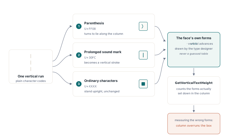
Substitution also changes the measurement. A vertical form can have its own advance, different from the horizontal glyph it replaces, so GetVerticalTextHeight applies the same substitution before it adds up the advances. Measure the horizontal forms and draw the vertical ones and the column overruns the box you reserved for it by a few points per bracket
None of this touches the text itself. Copy the column out of a viewer and you get 「コード」 back, because each vertical glyph maps to the character you passed in. Search and text extraction see your source string, never the rotated presentation forms
How the vertical metrics end up in the PDF
Each character in a vertical run advances by the distance the font's own vertical metrics give it. Open the output in a PDF inspector and you will find a Type0 font with Identity-V encoding whose CIDFont carries a W2 entry for every glyph used: the vertical advance from the face's vmtx table, half the glyph's width as the offset to the column's centre line, and the vertical origin. ISO 32000-1 §9.7.4.3 defines those three numbers. For a face with no vertical metrics there is no W2 array, and the DW2 default advances every character by exactly one em
The vertical origin is where third-party fonts disagree with each other. The vhea table has ascender and descender fields that look like the obvious source, but the descender's sign convention is not shared across faces. Read the field from the Windows copies with any font table viewer and it comes out +140 in MS Gothic and +120 in Yu Gothic, against −144 in SimSun and −500 in MingLiU, and the values can change with font versions. Any position derived from that field drifts by a different amount for each face. PDF Library for Delphi takes the origin from the vertical ascender, which the CJK faces named above report consistently, and falls back to 880 units — the default the PDF specification itself gives DW2 — when a face reports nothing plausible
Positioning vertical glyphs by hand has its own trap. Horizontal text often fixes spacing with numbers inside a TJ array. Under a vertical writing mode, ISO 32000-1 §9.4.4 applies those numbers along the column, so a correction computed for horizontal spacing pushes each character further down the page. That is why a vertical run in the content stream is one plain string of glyph codes with no adjustments at all, and every bit of spacing comes from W2
When you check output, look at the ink instead of the dictionaries. Finding /Identity-V in the font proves the encoding was declared; it says nothing about which way the text actually runs. Rendering the page and measuring the bounding box of the drawn pixels does: a seven-character run should come out about one character wide and seven characters tall
One vertical run on a horizontal page
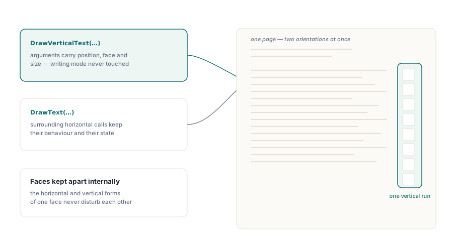
DrawVerticalText draws a single run vertically and leaves the writing mode alone. It takes the position, the font name, the size and the text, so the current font selection stays untouched too. Spine labels, seal stamps, a single column of names beside a table: these are the vertical exceptions inside a horizontal document, and toggling a global mode on and off around each one is more state than the job deserves
// One vertical run inside an otherwise horizontal page
if Lib.DrawVerticalText(520, 96, 'MS Mincho', 14, '保守点検記録') = 0 then
begin
  // The face could not be opened or could not set this text.
  // LogLayoutProblem is your own routine, not part of the library
  LogLayoutProblem('vertical label on page ' + IntToStr(Lib.SelectedPage));
end;
// The horizontal text around it is unaffected
Lib.DrawText(72, 96, 'Maintenance inspection record');
A page that mixes both directions carries the face twice in its resources, once with horizontal encoding and once with Identity-V, built from the same font program. Each direction keeps its own metrics, so a Japanese book page with vertical body text and horizontal running heads, or a Chinese certificate with a vertical title over horizontal detail lines, comes out with both directions spaced correctly
The return value is the reason we reach for DrawVerticalText even in documents that are mostly vertical. In mode-based drawing, a run that cannot be set vertically is drawn the ordinary horizontal way instead of being dropped, and DrawText reports success either way. For body text that is the better default, since a stray horizontal line is easy to spot in proof and a missing paragraph is not. For a label whose direction is the whole point, use DrawVerticalText and treat a 0 as a layout failure
Laying out columns from right to left
Column order is yours to decide. Japanese and traditional Chinese vertical text reads column by column from right to left, so a page starts at its right margin and each new column sits to the left of the previous one. No writing mode setting can infer that from the text, and the same goes for page order in a book bound on the right and for where furigana, footnotes and figure captions belong
The routine below breaks a string into columns that fit a fixed height, measuring with GetVerticalTextHeight as it goes and stepping leftward by one and a half ems per column:
procedure DrawColumns(Lib: TPDFlib; const Face: WideString; Size: Double;
  const Text: WideString; Right, Top, BoxH: Double);
var
  Col, Trial: WideString;
  I: Integer;
  X: Double;
begin
  // Suggested guard, not a library check: a zero height means the face
  // could not be opened, and the loop below would never break a column
  if Lib.GetVerticalTextHeight(Face, Size, Text) <= 0 then
    Exit;
  X := Right;                                  // first column at the right margin
  Col := '';
  for I := 1 to Length(Text) do                // assumes no surrogate pairs
  begin
    Trial := Col + Text[I];
    if (Col <> '') and (Lib.GetVerticalTextHeight(Face, Size, Trial) > BoxH) then
    begin
      Lib.DrawVerticalText(X, Top, Face, Size, Col);
      X := X - Size * 1.5;                     // next column to the left
      Col := Text[I];
    end
    else
      Col := Trial;
  end;
  if Col <> '' then
    Lib.DrawVerticalText(X, Top, Face, Size, Col);
end;
Re-measuring the trial string on every character is slower than summing advances, but it measures exactly what will be drawn, substitutions included. What the loop does not do is apply kinsoku rules. A closing bracket or 。 at the top of a column, or an opening bracket stranded at the foot of one, is a typesetting error to a Japanese reader, and fixing it means pulling or pushing a character across the break before you draw. Surrogate pairs need the same care: indexing Text[I] splits a character outside the Basic Multilingual Plane in half, so step by code point if your text can contain one
For documents assembled from data, the walkthrough of text search and page element enumeration shows how to read back what landed on each page, which is a quick way to confirm every column carries the characters you meant it to
Which font should a vertical document use?
A CJK face with its own vertical metrics and a vert or vrt2 feature. Without them you get upright characters advancing one em at a time and no shape changes. When vertical text looks subtly wrong, examine the font before you examine the code. A table viewer that lists a face's GSUB features and its vhea and vmtx tables will tell you in a minute whether the face can do the job
DrawVerticalText and GetVerticalTextHeight open an installed face by its name through Windows. In Lazarus builds for other platforms, vertical writing goes through SetVerticalWritingMode and DrawText, which work from the program of the font you loaded and selected, so the same vertical forms and metrics apply as long as that font is the CJK face you meant to use
Embedding follows the usual rules and the usual costs. A full CJK face runs to many megabytes, so subsetting is the sensible default for any document that leaves your machine. The notes on PDF file size optimization and font subsetting cover what to expect, and the walkthrough of embedding missing fonts into an existing PDF covers the repair case where a vertical document arrives without its fonts
Vertical CJK writing sits in the same drawing API as the rest of the text functions in PDF Library for Delphi, a native Pascal PDF library for Delphi, C++Builder and Lazarus. The PDF Library for Delphi product page lists the full set of font and text features alongside it